Sunday, 25 April 2010

Review: Editing Final Product

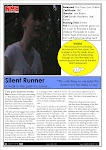
There were a number of little things we added to the review to make it look more professional and suited to the magazine. As the NME magazine often uses colours like yellow and blue we decided to make this our colour scheme. We also added this little verdict box that gave a straight to the point review in a couple of short sentences. We also used the thumbs-up/thumbs-down system to rate it rather than using stars as we felt this was more suited to the NME.
We also added the NME logo to the page to show that it was from that magazine.

Review: Drafting Layout

When it came to drafting the layout to the film we did have some difficulties as we had a number of different shaped boxes with information in them and had to find a way to fit them around each other. We decided it would be best to have the picture at the top of the page as it is what would draw the reader in to the review. We've kept the main bulk of the writing at the bottom of the page and the information boxes to the right side of the page. We felt this had a good look to it as it has a number of different bits without looking clutered.

Review: Choosing most appropriate images from film

Choosing a still shot from the film to use as the image in the review was quite straightforward. From what we had seen from other reviews was that images used are often taken from the climax in the film, this way it shows the reader what they can expext when they see the film.
For our image we decided to go for a shot from the chase scenes, when the mise en scene is dark and gloomy and the runner is at her most scared.

This is the image we chose for the review as we felt it showed the 'horror' element to the film withot giving away too much of the story.

Review: Drafting Text

When writing the film review we decided to write about it from a negative point of view. We did this as we felt it made it more realistic as film reviews are written form an outsiders perspective and usually take a critical stance. The only thing we didn't want to do when writing from a negative point of view was to demean the film too much. Because of the negativity of the review we felt we were able to then highlight positive aspects. By writing the review this way we felt it made it more enjoyable for the reader. Another way we made the review seem realistic and enjoyable was to write it in an almost satirical way, using jokes and sarcasm to highlight the issues in the film rather then just stating them.
For the film review we also drafted an 'info' box, which holds basic information about the film such as running time and cast. It also includes a brief description of the film. We felt this was a nice additive as often people will scan a magazine before reading it thoroughly and the 'info' box is useful for them as they can still receive information about the film without having to go through the whole review.


Review: Analysing design & language conventions of magazine reviews

When looking at other film reviews to see what they usully entail I found that most magazine film reviews have the same conventions. They feature a picture from the film, the review, pull quotes and information about the film such as the director and actors. Other features are usually individual to magazines such as ratings and fact files.
Some magazines also have certain language conventions, such as using humour to highlight and ridicule parts of the film. I particularly liked this convention as i felt it was a good way to connect and include the audience in what is being written.

Review: Researching different film magazine audiences

Before writing the magazine review for the the film we first looked into what type of magazine the review would feature. When looking into reviews featured in magazines what we found was that often magazines will only feature films that are suited to the reader of the magazine.
For example a 'teeny bopper' magazine would not feature a review of an Action film nor would a Men's' magazine feature a review if the latest Disney film.

Another aspect of magazines that can determine what films they feature is the age the magazine is aimed at. There may be two kinds of magazines that are similar in what they feature but because they are aimed at two different age groups the films will be different. For example, they may both feature films that are romantic but one magazine may be aimed at teenagers and will have romantic films for a teenager. Whereas, film in the other magazine may be more 'grown-up' because that is what is better suited to the audience of the magazine.
Because of the genre of our film and the age group we've aimed it at we decided it would be best if we chose a magazine that is aimed at a similar audience. The magazine we chose to feature our review in is the NME. Even though this magazine is a music magazine it does often feature film reviews. The NME is aimed at males and females aged 14 - 25which is the same target group as our film. The music featured in NME is of a Rock/Indie genre which we felt suited the 'Horror' aspect of our film.

Tuesday, 23 March 2010

Poster: Drafting/ Editing

When it came to drafting our film poster we decided it would be best if we made a few different posters then decided which one we preferred. For each poster the image was different but the look of the layout, fonts and information was pretty much the same. For the posters a number of the pictures were edited to suit the film. Being able to edit pictures made it a lot easier to achieve our desired outcome.
In the poster we chose as the final one; a second image of the runner has been transferred on the image to make it look like there are two of them. We did this by cropping the image of the runner from one picture then just placing it on the other poster.


This is the first film poster we made. The idea behind this poster was from the original script in which the Runner was run over. The hand is meant to represent her death and the headphones are to show that shes a runner. Although we did like this poster, we felt after the change in the script we wanted something that went better with the new storyline.


This was the second poster we made, out of all the posters we made we never felt like we were going to use this one, but did enjoy the editing aspect to it as it is this poster that gave the idea for the final one.


This was the final poster we made and the one we have used for the film. There are a number of reasons we felt this was the stronger out of all the posters. The first thing we like about this picture is the setting of it. By having the fence and the trees we feel it gives a sense of isolation and entrapment. However, the sunlight seem to give a hope that she can get out of where she is. The images of the two Runners, with one looking over the shoulder at the other one, is meant to represent that she is being chased. It is meant to be unclear as to why or even who she is being chased by, even though in the film we can see it is the stalker. The idea of having her chasing herself on the poster rather than the stalker is that even in the film it is unclear as to why he is chasing her, as we wanted to portray the idea that she may be running form her own psychological problems rather than a physical being. To create this double image we pasted the image of the runner from one picture to the other.