Tuesday, 23 March 2010

Poster: Drafting/ Editing

When it came to drafting our film poster we decided it would be best if we made a few different posters then decided which one we preferred. For each poster the image was different but the look of the layout, fonts and information was pretty much the same. For the posters a number of the pictures were edited to suit the film. Being able to edit pictures made it a lot easier to achieve our desired outcome.
In the poster we chose as the final one; a second image of the runner has been transferred on the image to make it look like there are two of them. We did this by cropping the image of the runner from one picture then just placing it on the other poster.


This is the first film poster we made. The idea behind this poster was from the original script in which the Runner was run over. The hand is meant to represent her death and the headphones are to show that shes a runner. Although we did like this poster, we felt after the change in the script we wanted something that went better with the new storyline.


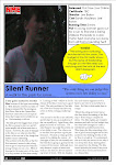
This was the second poster we made, out of all the posters we made we never felt like we were going to use this one, but did enjoy the editing aspect to it as it is this poster that gave the idea for the final one.


This was the final poster we made and the one we have used for the film. There are a number of reasons we felt this was the stronger out of all the posters. The first thing we like about this picture is the setting of it. By having the fence and the trees we feel it gives a sense of isolation and entrapment. However, the sunlight seem to give a hope that she can get out of where she is. The images of the two Runners, with one looking over the shoulder at the other one, is meant to represent that she is being chased. It is meant to be unclear as to why or even who she is being chased by, even though in the film we can see it is the stalker. The idea of having her chasing herself on the poster rather than the stalker is that even in the film it is unclear as to why he is chasing her, as we wanted to portray the idea that she may be running form her own psychological problems rather than a physical being. To create this double image we pasted the image of the runner from one picture to the other.

Poster: Choosing most appropriate images


As we had a number of different images to choose from we had quite a job deciding which ones were the best suited to the film and the poster. As we also had the option to edit the pictures this gave us the option to manipulate the pictures to how we wanted them to look. One of the first things we did was to separate the good pictures from the bad ones; ones that were blurry etc we didn’t want for our poster. Once this was done we then stared designing the poster to how it would look and were putting the pictures on it to see which ones looked best and which ones suited our original sketches the best. This process would have been a lot easier if we had not taken so many pictures, however having so many pictures did give us the option to choose the most appropriate ones.

Poster: Exploring Fonts

When deciding what fonts we wanted for the film poster we had already discussed in the designing process that we wanted to have a simple plain font as we felt this would match the Horror film genre better than using on that was intentionally meant to look scary. However, we did try out a number of different fonts to see what would look best. One place we found for fonts was the website http://www.dafont.com/, on this website you can look through a number of different fonts and then download the one you like. We took a number of different fonts from this website but in the end settled on Century Gothic which we adapted to our film by making the ‘T’ look like a red cross. We felt this gave it a recognisable Horror stlye look.


This is the final font we used for our film poster and also in the credits to the film.
Here are a number of different ones we also tried out:

Poster: Setting up mise en scene

Once we had sketched a few possible designs for the film poster that we were both happy with; we then went on to taking them. As we had quite a few possible designs we had to take a number of pictures in different areas. One thing we did want was the element of isolation to come across in the poster, as we felt this was one way we could show the Horror film genre to the audience without actually having to mention it. Which is what is often done in other Horror film Posters. To take the pictures for our poster, the first place we went was to the forested area we had been filming in as we felt this would give the best look of isolate, as it had been in the film. A number of the pictures we took for the poster were taken before we changed the ending to the film, therefore were meant to hint at the original ending.

Poster: Sketching possible images/ fonts

When it came to sketching our designs; we both decided that we would separately sketch designs and then come together to discuss the pros and cons of each. We also decided that as our film was a horror film we’d be best with a plain and simple font. Once we came together we then collaborated our ideas and then together came up with a few ideas and sketches.

Poster: Pitching ideas for poster

One of the first things we did was to start to plan how the poster would look. Having already looked into other film posters we already knew which conventions we wnted the poster to have.

We discussed what sort of image we would have and what the layout would be. Once we had made these decisions we could then start sketching out our plans. At this point we still did not have a definate name for the film and were still using the working title of 'The Runner', so this is another idea we had to pitch to one another.

Poster: Analysing Conventions of Film Posters

Before we began to come up with the ideas for our own film poster we looked into the designs of other film posters. We found when it comes to film posters there are always certain things that should be displayed on them. These include; title, tagline, age certificate, actors/directors etc... By having these specific things on the film poster audiences can easily define that it is a film poster. Another important part to the film poster is the image. The image is rarely a still shot from the film and is often a pre-planned image that will highlight the genre of the film and advertise it in the best way possible.
As our film is a Horror film we did look at a number of horror film poster to see how these look and what they usually entail. Horror film posters usually use the image and the title to highlight the genre and 'lure' the audience into watching it as with these films the genre is often the main selling point as it is with our film.
Knowing that film posters tend to have the same conventions on them we could then go on to planning our own film poster.