In what ways does your media product use, develop or challenge forms and conventions of real media products?
The first way in which our film uses, develops and challenges forms and conventions of media products is through the convention of narrative structure. For most of our film we followed the classic five-part structure of film. We started with the exposition; of Sarah (The Runner) getting ready in her house. Then we followed with the development of the story; Sarah running to her destination. The complication: the audience see her getting lost and the man following her. Then onto the climax where the audience see her running away from what is presumably the man. The way our film challenges the structure of a film is by not having a resolution. The film ends on the climax, depriving the audience of a resolution. The film ends with the runner screaming. However the audience cannot see what she is screaming at and do not get to find out if it is the man chasing her.
Throughout our film we have used relatively basic camera techniques to portray what we wanted to the audience. We used a variety of camera angles and movements; like close ups and long shots to show what we wanted the audience to see and understand from each scene. This is shown in a close up of her face when she hears the twig snap, the close up lets the audience see how scared she is. There are few exceptions to this when we used different angles to challenge the use of camera. An example of this is when we use a ‘Dutch-tilt’ camera angle to produce a sense of fear for the audience. The way the dutch-tilt helps do this is because it makes the shot unbalanced compared to the usual balanced angles used to portray everyday life. The unbalanced gives the audience a sense of foreboding and gives an indication that something bad may happen.

For our editing of the film we used traditional forms of editing. Cutting from scene to scene and from various shots which is shown when she drinks from the water bottle. We cut from showing her open the bottle to a close up of her drinking from it then cut back to the medium shot of her closing the bottle. We made sure we used continuity editing throughout so the film made sense to the audience. One of the ways we challenge editing is through the use of an eye-line match. As the runner is lost she is looking around, as we have a close up of her face we hear a cracking sound from off screen, the runner looks toward the sound out of camera but we do not show the audience what she has seen. This gives a sense of fear to the audience as they know something is there but do not know what it is or what it may do.

We use a variety of different sound techniques in our film. We rely on ambient and diegetic sounds in the film to help us put across the different feelings we wanted in certain parts of the film. For example the sounds of nature as the runner runs alone help to put across the feelings of isolation and vulnerability. The way we challenged the convention of sound in film is by having no dialogue throughout the film. This meant that for the audience to understand the characters we had to use the other conventions of sound to give effects that we would have originally used dialogue for. The lack of speech also means that the audience have to focus on the diagetic sound in the world of film, this way they can hear the difference between the loud roads and the silent forest, which may have been unnoticed otherwise. To help add to the ambience of the film we added non-diagetic sound in the form of our soundtrack (Teardrops by Massive Attack), we felt that the music we chose to go with our film gives a 'creepiness' to the situation The Runner is in. with the music we used we had it start when the Runner put her headphones in, this allowed the audience to be able to be involved in the Runners journey as they are listening to the same music as her.
Regarding Mise-en-scene, as the majority of this film was shot outdoors we relied heavily on natural lighting. This worked in our favour, because scenes which are supposed to give the audience a sense of fear have a natural darker lighting to other scenes. This helps us show the vulnerability of the runner when she is alone in a darkened forest.
Throughout the film the setting changes with the progress of the runner. When she begins she is safe in her own home compared to the end where she is alone in a forest. This gradual change of setting works with the progression of the story as it helps show how she ends up in danger. The way we challenge the usual conventions of film is through the lack of dialogue in this film. By doing this the characters had to show their feelings and emotions in different ways, through their facial expressions and body language, rather than through speech.
How effective is the combination of your main product and ancillary texts?

The language used in the poster lets the audience know what genre the film is. The title ‘Silent Runner’ suggests a sense of fear, which lets the audience know that the film is likely to be of a thriller/horror genre. Using the word silent suggests to the audience that something is going to be there that they don’t know about and neither does the ‘The Runner’. The tag line also ties in with this ‘One Step Too Far’ making the audience think that once The Runner has done something there will be no turning back. The title and the tag line together hint to the audience that something scary is going to happen in the ending.

The design of the poster highlights specific parts, so the audience can see what the film may be about. The colour scheme to the poster is green and yellow which blend in with the colours of the nature in the image. This helps to make the red coloured ‘T’ in Silent Runner standout. The ‘T’ in silent runner is shaped like a cross and coloured in red compared to the rest of the title which is black. This gives a sense of evil as it is giving a colour which is often associated with evil to a symbol which is often associated with good. This makes it seem as though some form of evil may have taken over in the film. Because of the size and the red colour to the title it is the most noticeable thing on the poster. None of the text on the poster covers the main image of the two runners. This shows the importance of the image over the text, it also helps to draw the audiences’ eye to the image. To help link the Poster and the film we also made an Institution Logo calle 'MegaZone Pictures' which can be seen in the end credits of the film and at the bottom of the review. By having this Logo it shows the audience that the film and poster are part of an institution similar to that of film institutions such as 'Dreamorks' and 'Paramount'.


Alongside the poster we also wrote a magazine review of the film. The review has been written to give the audience extra information about the film with a personal viewpoint to the film. The review has been written from a critical perspective with the ‘writer’ highlighting what is wrong in the film and making fun of this. Doing this has meant we could highlight what could be improved in the film but also what makes the film successful.
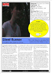
The image used in the film review is taken directly from the film and is from the part where the runner is supposedly the most scared, using this image shows the audience that reads the review that the film will have a scary twist. It highlights the genre of the film without it needing to be said. The rest of the layout has been designed so that the review would not look out of place in a music magazine such as the NME; we have done this as this is the type of magazine that may have reviews on short films. The readers of NME are also of a similar audience to whom the film is aimed.
The concept of a brand is put across to the audience by highlighting the genre of the film in each area. The film poster and review both use images to let the audience know the film is of a horror genre. By doing this the film is then part of a brand, which is a reason as to why an audience would make the decision to see the film.
How did you use media technologies in the construction and research, planning and evaluation stages?
The main form of technology we used was the Adobe Premiere, which was used to edit the film. Parts of this software were relatively easy to use, and produced a good effect. The finished product looked well done and was consistent enough to make the film look realistic.
 The software has a number of features which allow the user to change the look of the film. I found that these were helpful in the editing if my film. One feature I found useful is the ability to edit the colour of shots; as a number of our scenes had been filmed on different days, this meant that sometimes the lighting in the shots didn’t match each other and was ruining the continuity. Being able to change the colour of the shots to match each other did make the film look more realistic. Another feature of the Adobe Premier was the ability to control the sound in the background of scenes and being able to add music without difficulty. As some of our scenes had been filmed by the road there was often loud sounds from oncoming cars, this was ruining the ‘spooky’ ambiance that we were trying to set in the film. By being able to adapt the sound meant we could lower the sound of the background noise in these parts and increase the volume of the music. Being able to alter the sound in our film allowed us to be creative as, with the lack of dialouge, music and sound was important to our film. Another good aspect to the Adobe was the ability to add title sequences to the film. Being able to do this has meant that the film looks more professional. However, when I began the process of making the titles I did struggle at points, as there was no clear outline as how to do it. But once I had figured it out it was quite straightforward and I feel has produced an effective outcome.
During the editing process I did encounter a few problems; however, I did find that most of these were down to my lack of knowledge of the system and not the system itself. That would be my only problem with the Adobe software; that it does take some practice to learn how to make it all work.
Another form of technology we used throughout our film process was the Blog system. There is a number of ways in which the Blog System (http://www.blogger.com/) helped us to show the process of making our film. From planning, to filming, to editing and evaluating the film has all been recorded on the Blog. Doing this has meant we have been able to keep track of our process whilst posting about it as we have done it. Making a Blog has had certain advantages over evaluating our film process in essay. By constantly updating what we had done has made the Blog similar to a diary. Another positive thing about the Blog is that we can make it as interactive and creative as we like, meaning we can add pictures, videos and scans of any work we had done during the planning. By doing this, not only does it make the Blog more interesting to who is viewing it but it also means that they can easily view our whole process without having to read lengthy descriptions.
One other form of technology we used was the Macromedia Fireworks. This gave us the ability to edit, manipulate and be creative with pictures and text for the film poster and the film review. The Fireworks system was straightforward to use but did produce a good effect and, depending on the skill of the person who was editing the pictures, looked quite professional. Once the pictures and text had been edited, we then used the Microsoft Publisher to make the film posters and review. Combining these two programmes meant we could produce effective looking texts that, combined with the film, made the set look real.
What have you learned from your audience feedback?
To gain audience feedback we used a method of handing out questionnaires to audiences after they had watched the film and asked them a number of questions to gauge their responses. To get a fair response we asked an even number of girls and boys from a set of age groups.
The first question we asked our audience was – What Genre so you think the film is?

As you can see a staggering 98% of our audience correctly identified the film as being a Horror. Other film genres suggested were Mystery and Adventure.
The second question we asked our audience was – What is the film about and could you follow the story easily?
The majority of the audience could identify what the film was about but some of them stated that the pace of the film made it hard for them to follow.
The third question we ask our audience was Do you think the film has an idelogical message, if so what is it?

The majority of our audience believed the film portrayed a message. Most people believed the message was in regards to personal safety.
The next film we asked our audience was – What did you think of the film? From this question we mainly received good reviews, with 70% of the audience feeling the film was excellent and the rest feeling it was Good or Satisfactory. None of our audience felt the film was not enjoyable or badly made.
When asking our audience what they felt made the film a success we received a variety of reasons. These included the suspense the sound and music gave the film, “the sound was effective when it got to the climax of the film and the music has more tension in it...” “It was effective that the music coincides with when the actress puts her headphones in.”
For our audience feedback we also asked our audience to let us know what they felt what was weak with the film and what they would do to improve it. What I found was interesting in the replies to this was that what some people found made the film weak others found that improved it and added to the suspense. In reference to the choice to have no dialogue one audience member stated “only having music made it a bit boring” whereas another stated “having no talking added to the tension”. This split decisions is also presented in how the audience felt about the hand held camera movement. Once audience member stated “I would change the shaky camera” whereas another stated “the shaky camera made it scary as it seemed he was right behind her”.
What I have found from the audience feedback is that there is little we could have changed as what was faulted by some of the audience members was then praised by others. However, it was interesting to see how effective the film was with our audiences.
Another part of our feedback was to interview some of our audience members to get a further insight into the film.

The first way in which our film uses, develops and challenges forms and conventions of media products is through the convention of narrative structure. For most of our film we followed the classic five-part structure of film. We started with the exposition; of Sarah (The Runner) getting ready in her house. Then we followed with the development of the story; Sarah running to her destination. The complication: the audience see her getting lost and the man following her. Then onto the climax where the audience see her running away from what is presumably the man. The way our film challenges the structure of a film is by not having a resolution. The film ends on the climax, depriving the audience of a resolution. The film ends with the runner screaming. However the audience cannot see what she is screaming at and do not get to find out if it is the man chasing her.
Throughout our film we have used relatively basic camera techniques to portray what we wanted to the audience. We used a variety of camera angles and movements; like close ups and long shots to show what we wanted the audience to see and understand from each scene. This is shown in a close up of her face when she hears the twig snap, the close up lets the audience see how scared she is. There are few exceptions to this when we used different angles to challenge the use of camera. An example of this is when we use a ‘Dutch-tilt’ camera angle to produce a sense of fear for the audience. The way the dutch-tilt helps do this is because it makes the shot unbalanced compared to the usual balanced angles used to portray everyday life. The unbalanced gives the audience a sense of foreboding and gives an indication that something bad may happen.
For our editing of the film we used traditional forms of editing. Cutting from scene to scene and from various shots which is shown when she drinks from the water bottle. We cut from showing her open the bottle to a close up of her drinking from it then cut back to the medium shot of her closing the bottle. We made sure we used continuity editing throughout so the film made sense to the audience. One of the ways we challenge editing is through the use of an eye-line match. As the runner is lost she is looking around, as we have a close up of her face we hear a cracking sound from off screen, the runner looks toward the sound out of camera but we do not show the audience what she has seen. This gives a sense of fear to the audience as they know something is there but do not know what it is or what it may do.
We use a variety of different sound techniques in our film. We rely on ambient and diegetic sounds in the film to help us put across the different feelings we wanted in certain parts of the film. For example the sounds of nature as the runner runs alone help to put across the feelings of isolation and vulnerability. The way we challenged the convention of sound in film is by having no dialogue throughout the film. This meant that for the audience to understand the characters we had to use the other conventions of sound to give effects that we would have originally used dialogue for. The lack of speech also means that the audience have to focus on the diagetic sound in the world of film, this way they can hear the difference between the loud roads and the silent forest, which may have been unnoticed otherwise. To help add to the ambience of the film we added non-diagetic sound in the form of our soundtrack (Teardrops by Massive Attack), we felt that the music we chose to go with our film gives a 'creepiness' to the situation The Runner is in. with the music we used we had it start when the Runner put her headphones in, this allowed the audience to be able to be involved in the Runners journey as they are listening to the same music as her.
Regarding Mise-en-scene, as the majority of this film was shot outdoors we relied heavily on natural lighting. This worked in our favour, because scenes which are supposed to give the audience a sense of fear have a natural darker lighting to other scenes. This helps us show the vulnerability of the runner when she is alone in a darkened forest.
Throughout the film the setting changes with the progress of the runner. When she begins she is safe in her own home compared to the end where she is alone in a forest. This gradual change of setting works with the progression of the story as it helps show how she ends up in danger. The way we challenge the usual conventions of film is through the lack of dialogue in this film. By doing this the characters had to show their feelings and emotions in different ways, through their facial expressions and body language, rather than through speech.
How effective is the combination of your main product and ancillary texts?
There are a number of things we did to make the ancillary texts combine with the film. In the film poster there are a number of things that make it work with the film so they are part of the same brand rather than two separate items.
The image we have used for the poster is one of the main ways we have done this. The image on the poster is not from the film. We have taken a separate photo and have edited it in such a way that ties in with the film but also makes it look interesting. In the image there is two of the runner, one behind the other, to give a sense that she is being chased. The one in front is looking back at the other whilst the other runner seems to not notice her. It looks like the runner cannot escape the second runner which suggests to the audience that there is something in the film that she cannot escape. The surrounding to the image also adds to the feeling that she cannot escape. Behind the two runners is a fence, this fence suggest imprisonment and that they can’t get away from something. The trees surrounding them give a sense of isolation, so even though there are two of them they are very much alone.
The image we have used for the poster is one of the main ways we have done this. The image on the poster is not from the film. We have taken a separate photo and have edited it in such a way that ties in with the film but also makes it look interesting. In the image there is two of the runner, one behind the other, to give a sense that she is being chased. The one in front is looking back at the other whilst the other runner seems to not notice her. It looks like the runner cannot escape the second runner which suggests to the audience that there is something in the film that she cannot escape. The surrounding to the image also adds to the feeling that she cannot escape. Behind the two runners is a fence, this fence suggest imprisonment and that they can’t get away from something. The trees surrounding them give a sense of isolation, so even though there are two of them they are very much alone.
The language used in the poster lets the audience know what genre the film is. The title ‘Silent Runner’ suggests a sense of fear, which lets the audience know that the film is likely to be of a thriller/horror genre. Using the word silent suggests to the audience that something is going to be there that they don’t know about and neither does the ‘The Runner’. The tag line also ties in with this ‘One Step Too Far’ making the audience think that once The Runner has done something there will be no turning back. The title and the tag line together hint to the audience that something scary is going to happen in the ending.
The design of the poster highlights specific parts, so the audience can see what the film may be about. The colour scheme to the poster is green and yellow which blend in with the colours of the nature in the image. This helps to make the red coloured ‘T’ in Silent Runner standout. The ‘T’ in silent runner is shaped like a cross and coloured in red compared to the rest of the title which is black. This gives a sense of evil as it is giving a colour which is often associated with evil to a symbol which is often associated with good. This makes it seem as though some form of evil may have taken over in the film. Because of the size and the red colour to the title it is the most noticeable thing on the poster. None of the text on the poster covers the main image of the two runners. This shows the importance of the image over the text, it also helps to draw the audiences’ eye to the image. To help link the Poster and the film we also made an Institution Logo calle 'MegaZone Pictures' which can be seen in the end credits of the film and at the bottom of the review. By having this Logo it shows the audience that the film and poster are part of an institution similar to that of film institutions such as 'Dreamorks' and 'Paramount'.
Alongside the poster we also wrote a magazine review of the film. The review has been written to give the audience extra information about the film with a personal viewpoint to the film. The review has been written from a critical perspective with the ‘writer’ highlighting what is wrong in the film and making fun of this. Doing this has meant we could highlight what could be improved in the film but also what makes the film successful.
The image used in the film review is taken directly from the film and is from the part where the runner is supposedly the most scared, using this image shows the audience that reads the review that the film will have a scary twist.
It highlights the genre of the film without it needing to be said. The rest of the layout has been designed so that the review would not look out of place in a music magazine such as the NME; we have done this as this is the type of magazine that may have reviews on short films. The readers of NME are also of a similar audience to whom the film is aimed.The concept of a brand is put across to the audience by highlighting the genre of the film in each area. The film poster and review both use images to let the audience know the film is of a horror genre. By doing this the film is then part of a brand, which is a reason as to why an audience would make the decision to see the film.
How did you use media technologies in the construction and research, planning and evaluation stages?
The main form of technology we used was the Adobe Premiere, which was used to edit the film. Parts of this software were relatively easy to use, and produced a good effect. The finished product looked well done and was consistent enough to make the film look realistic.
The software has a number of features which allow the user to change the look of the film. I found that these were helpful in the editing if my film. One feature I found useful is the ability to edit the colour of shots; as a number of our scenes had been filmed on different days, this meant that sometimes the lighting in the shots didn’t match each other and was ruining the continuity. Being able to change the colour of the shots to match each other did make the film look more realistic. Another feature of the Adobe Premier was the ability to control the sound in the background of scenes and being able to add music without difficulty. As some of our scenes had been filmed by the road there was often loud sounds from oncoming cars, this was ruining the ‘spooky’ ambiance that we were trying to set in the film. By being able to adapt the sound meant we could lower the sound of the background noise in these parts and increase the volume of the music. Being able to alter the sound in our film allowed us to be creative as, with the lack of dialouge, music and sound was important to our film. Another good aspect to the Adobe was the ability to add title sequences to the film. Being able to do this has meant that the film looks more professional. However, when I began the process of making the titles I did struggle at points, as there was no clear outline as how to do it. But once I had figured it out it was quite straightforward and I feel has produced an effective outcome. During the editing process I did encounter a few problems; however, I did find that most of these were down to my lack of knowledge of the system and not the system itself. That would be my only problem with the Adobe software; that it does take some practice to learn how to make it all work.
Another form of technology we used throughout our film process was the Blog system. There is a number of ways in which the Blog System (http://www.blogger.com/) helped us to show the process of making our film. From planning, to filming, to editing and evaluating the film has all been recorded on the Blog. Doing this has meant we have been able to keep track of our process whilst posting about it as we have done it. Making a Blog has had certain advantages over evaluating our film process in essay. By constantly updating what we had done has made the Blog similar to a diary. Another positive thing about the Blog is that we can make it as interactive and creative as we like, meaning we can add pictures, videos and scans of any work we had done during the planning. By doing this, not only does it make the Blog more interesting to who is viewing it but it also means that they can easily view our whole process without having to read lengthy descriptions.
One other form of technology we used was the Macromedia Fireworks. This gave us the ability to edit, manipulate and be creative with pictures and text for the film poster and the film review. The Fireworks system was straightforward to use but did produce a good effect and, depending on the skill of the person who was editing the pictures, looked quite professional. Once the pictures and text had been edited, we then used the Microsoft Publisher to make the film posters and review. Combining these two programmes meant we could produce effective looking texts that, combined with the film, made the set look real.
What have you learned from your audience feedback?
To gain audience feedback we used a method of handing out questionnaires to audiences after they had watched the film and asked them a number of questions to gauge their responses. To get a fair response we asked an even number of girls and boys from a set of age groups.
The first question we asked our audience was – What Genre so you think the film is?
As you can see a staggering 98% of our audience correctly identified the film as being a Horror. Other film genres suggested were Mystery and Adventure.
The second question we asked our audience was – What is the film about and could you follow the story easily?
The majority of the audience could identify what the film was about but some of them stated that the pace of the film made it hard for them to follow.
The third question we ask our audience was Do you think the film has an idelogical message, if so what is it?
The majority of our audience believed the film portrayed a message. Most people believed the message was in regards to personal safety.
The next film we asked our audience was – What did you think of the film?
From this question we mainly received good reviews, with 70% of the audience feeling the film was excellent and the rest feeling it was Good or Satisfactory. None of our audience felt the film was not enjoyable or badly made.When asking our audience what they felt made the film a success we received a variety of reasons. These included the suspense the sound and music gave the film, “the sound was effective when it got to the climax of the film and the music has more tension in it...” “It was effective that the music coincides with when the actress puts her headphones in.”
For our audience feedback we also asked our audience to let us know what they felt what was weak with the film and what they would do to improve it. What I found was interesting in the replies to this was that what some people found made the film weak others found that improved it and added to the suspense. In reference to the choice to have no dialogue one audience member stated “only having music made it a bit boring” whereas another stated “having no talking added to the tension”. This split decisions is also presented in how the audience felt about the hand held camera movement. Once audience member stated “I would change the shaky camera” whereas another stated “the shaky camera made it scary as it seemed he was right behind her”.
What I have found from the audience feedback is that there is little we could have changed as what was faulted by some of the audience members was then praised by others. However, it was interesting to see how effective the film was with our audiences.
Another part of our feedback was to interview some of our audience members to get a further insight into the film.
The Questions we asked our audience were:
 This is the final draft of our poster.
 We also added the NME logo to the page to show that it was from that magazine.


 Another aspect of magazines
  Because of the genre of our film and the age group we've aimed it at we decided it would be best if we chose a magazine that is aimed at a similar audience. The magazine we chose to feature our review in is the NME. Even though this magazine is a music magazine it does often feature film reviews. The NME is aimed at males and females aged 14 - 25which is the same target group as our film. The music featured in NME is of a Rock/Indie genre which we felt suited the 'Horror' aspect of our film.